Automobili Lamborghini, the epitome of automotive excellence, has ushered in a new era with the unveiling of its revamped logo. After over two decades since its last alteration, the iconic emblem has undergone a significant transformation, reflecting the brand’s core values of bravery, innovation, and authenticity. This strategic redesign is not merely cosmetic; it symbolizes Lamborghini’s commitment to adaptability and evolution in a rapidly changing world.
Driven by the visionary Direzione Cor Tauri initiative, Automobili Lamborghini & its logo evolution is a pivotal aspect of the company’s broader transformation journey towards sustainability and decarbonization. By aligning its visual identity with its mission to push boundaries and exceed expectations, Lamborghini aims to inspire future generations while embracing innovation and sustainable progress.

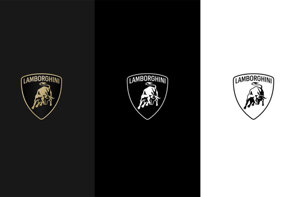
The new logo embodies a blend of minimalism and boldness, with a broader Lamborghini typeface and a refined color palette comprising black, white, and accents of yellow and gold. The iconic bull, synonymous with Lamborghini’s power and prowess, now stands prominently on its own, symbolizing the company’s unwavering focus on strength and individuality.

Source: Lamborghini
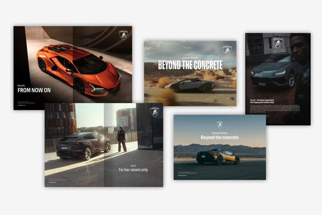
This redesign extends beyond the logo, encompassing an official Lamborghini typeface and a set of meticulously crafted icons, all echoing the brand’s distinctive style and design language. With these changes, Lamborghini seeks to establish a unified visual identity across all digital touch points, reinforcing its position as a trailblazer in the automotive industry.
Source: Lamborghini
The updated brand identity of Lamborghini resonates with the evolving landscape of established brands. As more and more iconic names adapt to modern trends, the shift towards a minimalistic and simplified logo feels like a natural progression. This strategic update not only enhances the brand’s visibility in merchandising and advertising but also contributes to an overall cleaner aesthetic.


