Source: Porsche
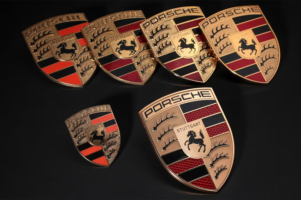
The Porsche crest stands as one of the most recognizable and revered emblems in automotive history. More than just a logo, it embodies the brand’s rich heritage, its deep connection to Stuttgart, and its commitment to performance and craftsmanship. The crest has undergone subtle yet meaningful refinements over the decades, maintaining its essential identity while evolving with the brand. Most recently, in 2023, Porsche introduced a modernized version of the emblem, seamlessly blending tradition with contemporary design.
Source: Porsche
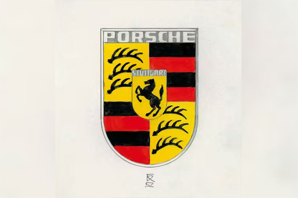
The origins of the Porsche crest trace back to 1951 when the company sought a unique symbol to represent its brand. Ferry Porsche, encouraged by influential car importer Max Hoffman, pursued the creation of an emblem that would solidify the company’s identity. Initial design competitions failed to produce a satisfactory result, leading Porsche to develop its own crest. The chosen design, finalized in 1952, was a masterful fusion of heraldry and branding, incorporating elements that reflected both the company’s roots and the performance-driven ethos of its vehicles.
Source: Wiki Commons
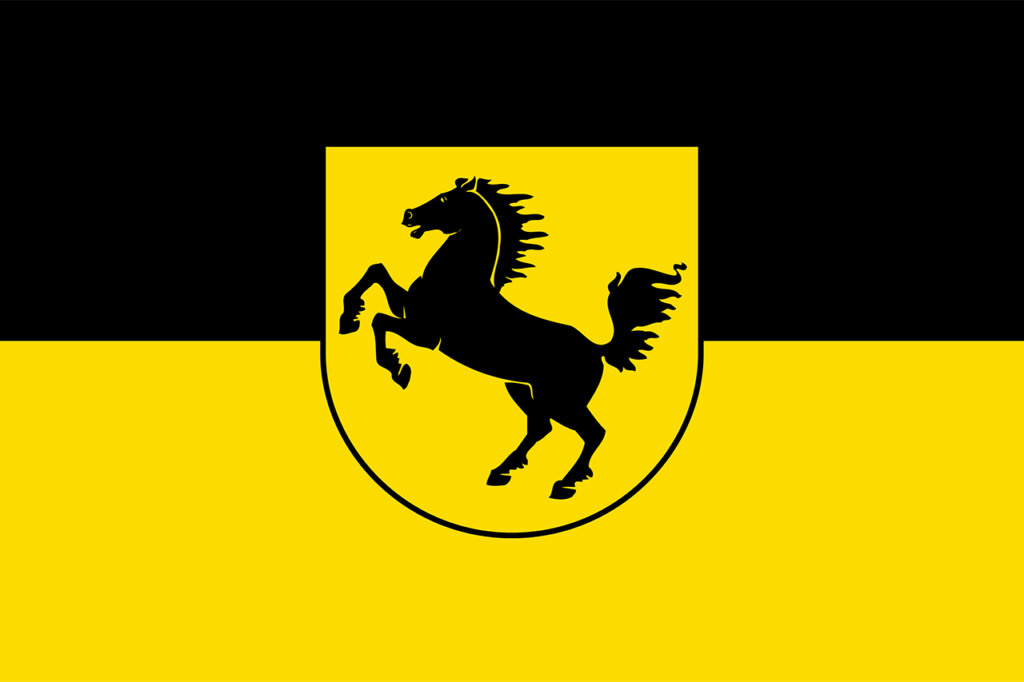
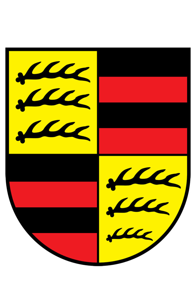
The crest’s design is deeply symbolic. At its center is a rearing horse, taken directly from Stuttgart’s city seal, paying homage to the city’s origins as a stud farm—’Stuotgarten’ in Old High German. This horse, captured in motion, represents agility, speed, and power, qualities that define Porsche sports cars. Surrounding the horse are red and black stripes and stylized antlers, elements borrowed from the coat of arms of Württemberg-Hohenzollern, the German state where Stuttgart is located. These components tie Porsche to its regional heritage, while also signifying strength and prestige. The golden shield encapsulating these elements enhances the emblem’s luxurious and distinguished appearance, reinforcing the brand’s elite status.
Source: Wiki Commons
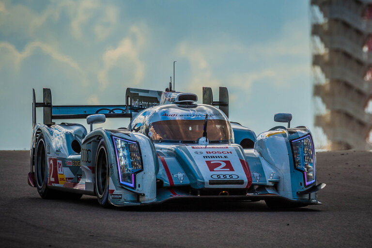
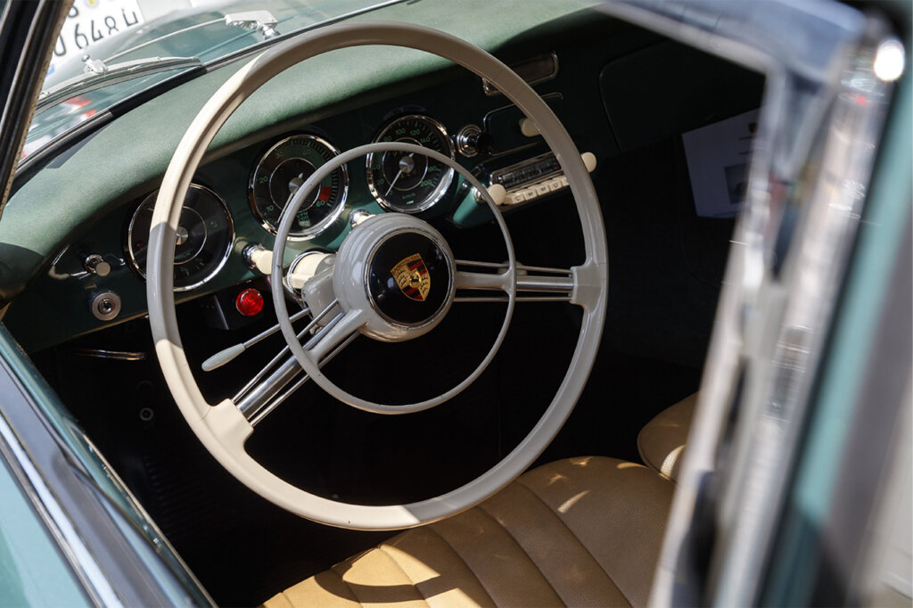
The Porsche crest made its first appearance on the steering wheel of the Porsche 356 in 1952. By 1959, it had been added to the hubcaps of production models, and in 1965, it was prominently featured on the hoods of Porsche vehicles. Over the years, the emblem has been carefully refined while retaining its original essence. Notably, high-performance race-focused models such as the Porsche 911 GT3 feature painted crests instead of traditional enamel badges, a weight-saving measure that aligns with Porsche’s commitment to performance.
Source: Porsche
In 2023, Porsche unveiled a modernized version of its crest to coincide with the 75th anniversary of the brand’s sports cars. The redesign process, which took three years to complete, introduced subtle yet impactful changes to bring the emblem into the modern era. The red stripes were given a contemporary honeycomb texture, while the gold surface received a refined brushed metal finish. These changes preserve the crest’s legacy while giving it a fresher, more high-tech aesthetic. The update ensures that Porsche’s emblem remains a timeless yet forward-looking symbol, representing a brand that is always evolving without losing sight of its roots.