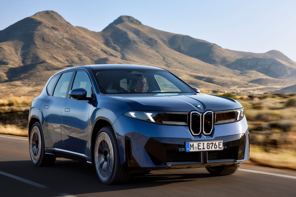
BMW recently unveiled their first series-production Neue Klasse model, the BMW iX3. The all-new design language and the abundance of new technology packed into this fully electric Sports Activity Vehicle (SAV) distracted from a subtle but significant update that will likely carry over across the rest of BMW’s lineup.
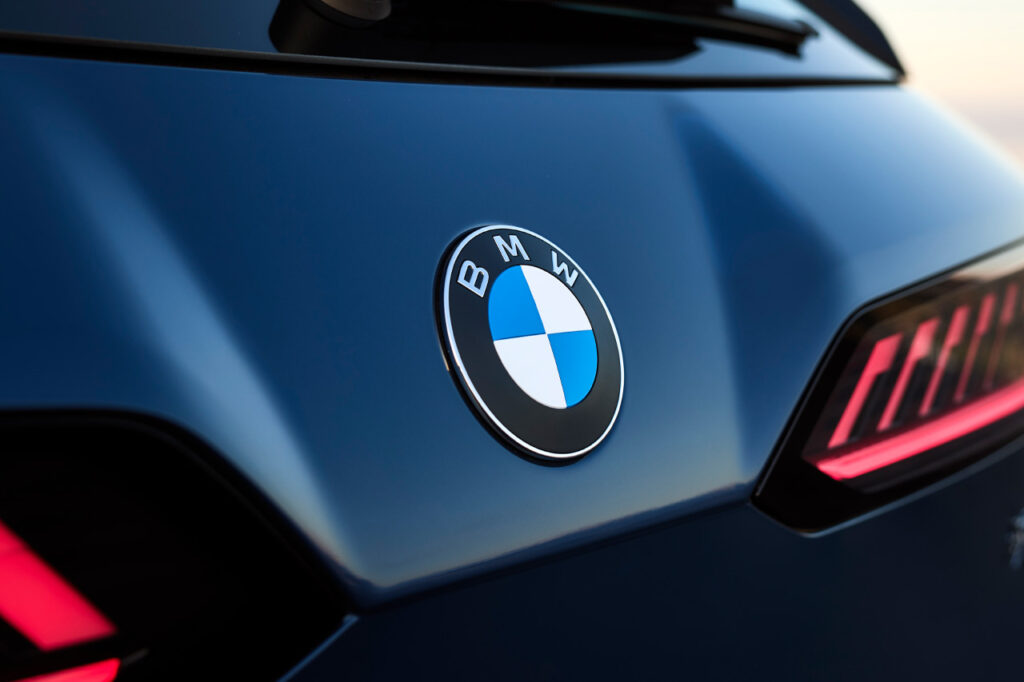
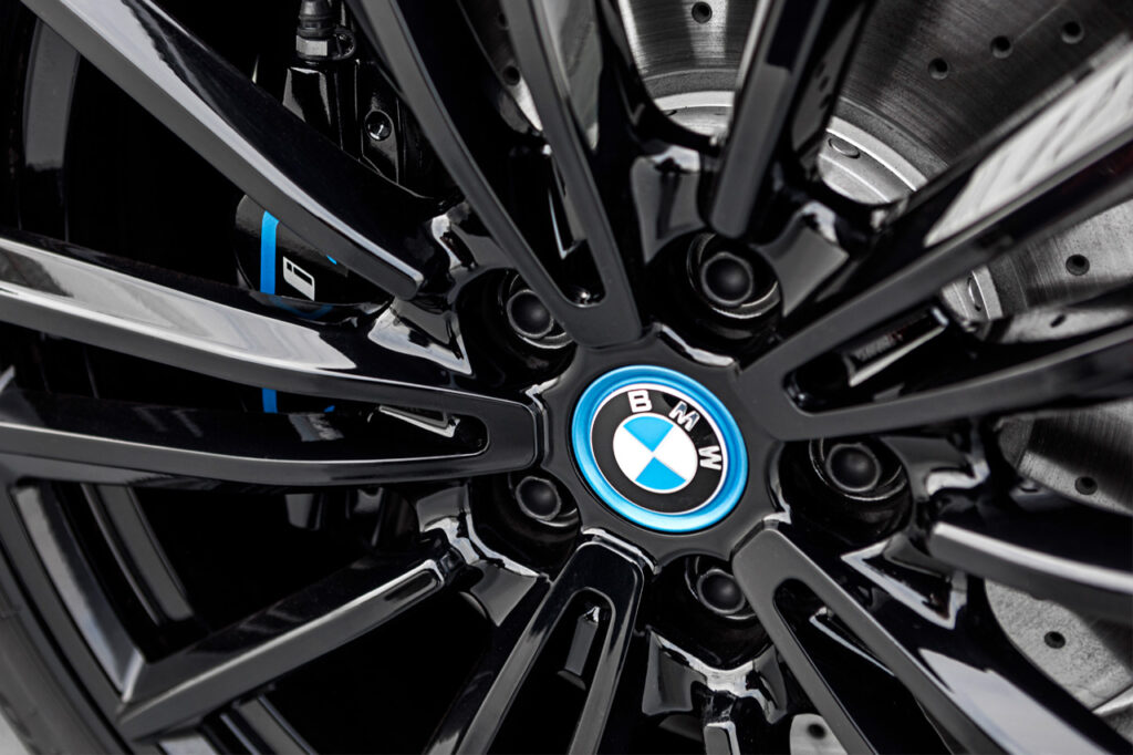
Those with sharp eyes may have noticed slight differences in the BMW logo that debuted alongside the iX3. To the casual viewer, it may appear identical to the previous version—but the details reveal otherwise. First, the chrome ring surrounding the Bavarian blue-and-white roundel has been removed, with black now fully encompassing the central circle. The chrome bars that once divided the blue and white quadrants have also disappeared, leaving only the BMW letters and the outer ring as the remaining chrome elements. The lettering itself has been slightly slimmed down, and the black ring now features a satin finish rather than the glossy look of earlier versions. While subtle, the difference becomes clear when comparing the new badge side by side with the old one.
Source: BMW
Source: BMW
Individually, these changes may seem minor, but together they create a noticeably more modern, cleaner, and more elegant refinement of the classic logo. In an interview with BMWBLOG, Oliver Heilmer, Head of BMW Design for the Neue Klasse, explained: “We wanted to keep the heritage, but bring more precision to the logo.” He added, “The chrome is still there, the letters have been refined with a shiny pattern you often find in watches, and the white surfaces now sit closer to the outer ring. It’s flat, but when you touch it you can still feel the ridges.”
This update also seems to mark the end of the blue-bordered BMW badge once reserved for electrified models such as the i8 and i3. While the change is subtle, it highlights BMW’s ongoing commitment to detail and continuous improvement.
Source: BMW